Sanlo's Store & Checkout Builder
Architecting Sanlo's pivot from underperforming platform to scalable monetization suite.
Role:
Lead Product Designer
Platform:
Web (SaaS)
Project Type:
Platform Redesign & New Feature Launch
Deliverables:
Strategy, Research, Architecture, UI Design, Usability Testing.
Team:
Product Manager, Front-end & Back-end Engineers, Junior Designer
Summary
Challenge
Sanlo's platform was underperforming and losing deals. Usability problems, a fragmented architecture, and a thin feature set left mobile gaming studios choosing better-equipped competitors.
Approach
I led a lean, research-driven redesign. Running interviews, surveys, and usability tests in rapid cycles, then architected a standalone checkout builder and redesigned the core catalog experience while extracting the financial product as a separate offering.
Results
25% increase in revenue.
Context / Background
Sanlo was a Series A startup building monetization tools for mobile gaming companies. Their platform combined financial products with e-commerce capabilities.
By the time this project began, the platform's promise wasn't matching reality. Years of accumulated decisions had left the architecture disjointed, the feature set shallow compared to dedicated e-commerce tools, and the overall experience difficult to navigate. Sanlo needed to move fast: win new customers, retain existing ones, and do it with a small team operating under real resource constraints.
My Role
As the lead designer, I owned the full design process, from research through shipped product.
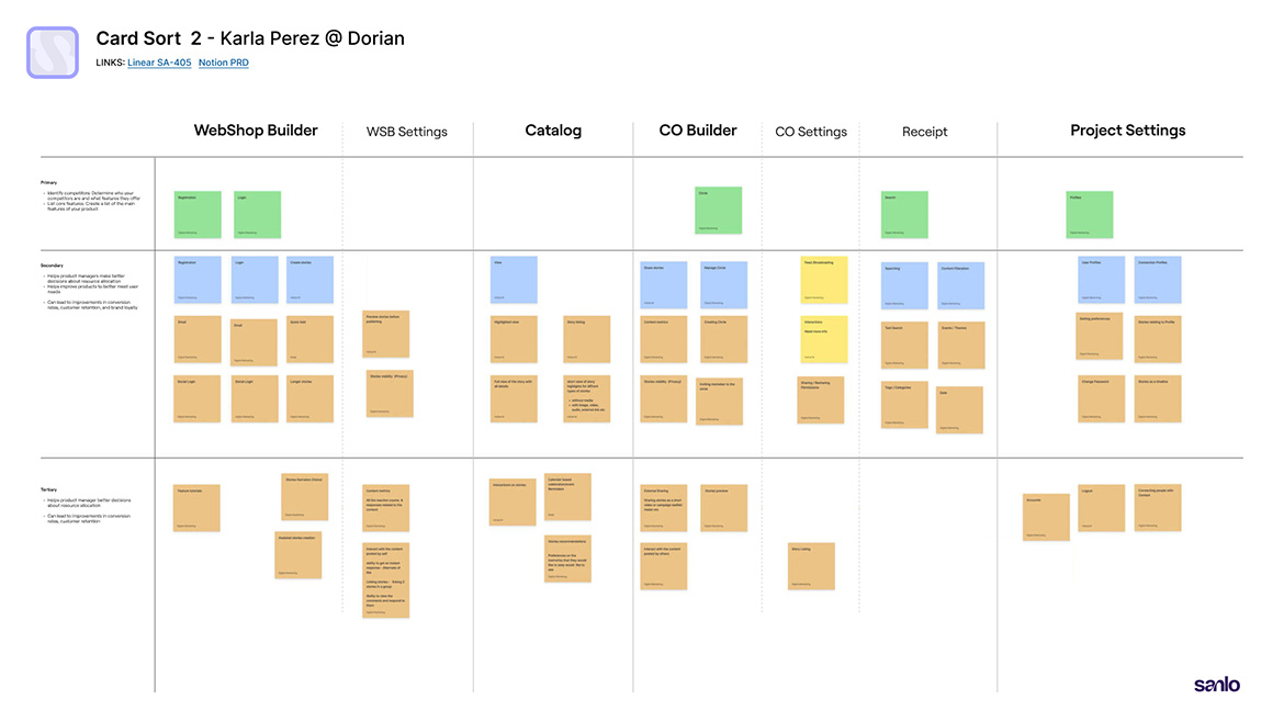
◆ Led all primary research: 8 user interviews, 34 surveys, 3 card sorting sessions,
and competitive analysis across 6 platforms and 5 live webshops.
◆ Drove the architecture, addition of dev environments, and multi-project navigation.
◆ Designed and prototype-tested 5 rounds of concept and usability studies.
◆ Owned all UX and visual design across:
Checkout builder, catalog redesign, receipt builder, and marketing webite
◆ Partnered with a junior designer while managing design handoff with engineering
Strategy
The core question wasn't:
How do we improve the interface?
It was:
What does Sanlo need to do
in order to compete?
The answer required making architectural changes, building new products, and fixing foundational usability with limited resources. I organized the work around four strategic pillars.
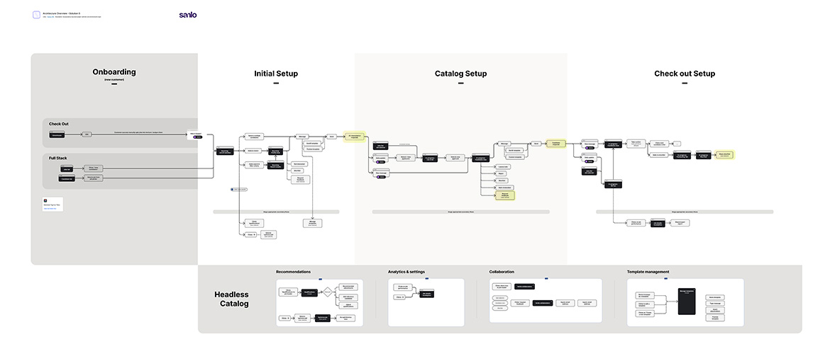
Restructure the Architecture Before Adding Features
Before any new product could land well, the platform's structure had to change. Studios needed to operate across multiple environments (dev and production) and navigate between projects without losing context. I redesigned the information architecture to introduce environment switching and multi-project navigation as first-class concepts — not bolted-on additions.
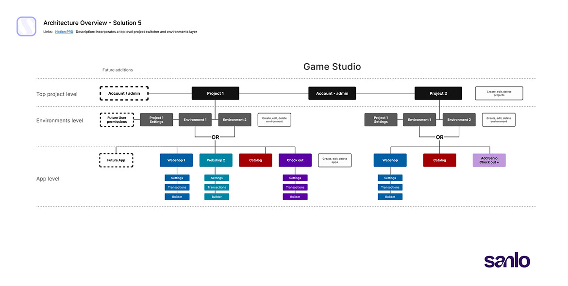
User flows were rebuilt alongside the architecture to accommodate the new checkout product and ensure the onboarding path didn't strand users in an experience designed for an older, simpler platform.
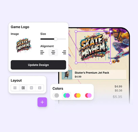
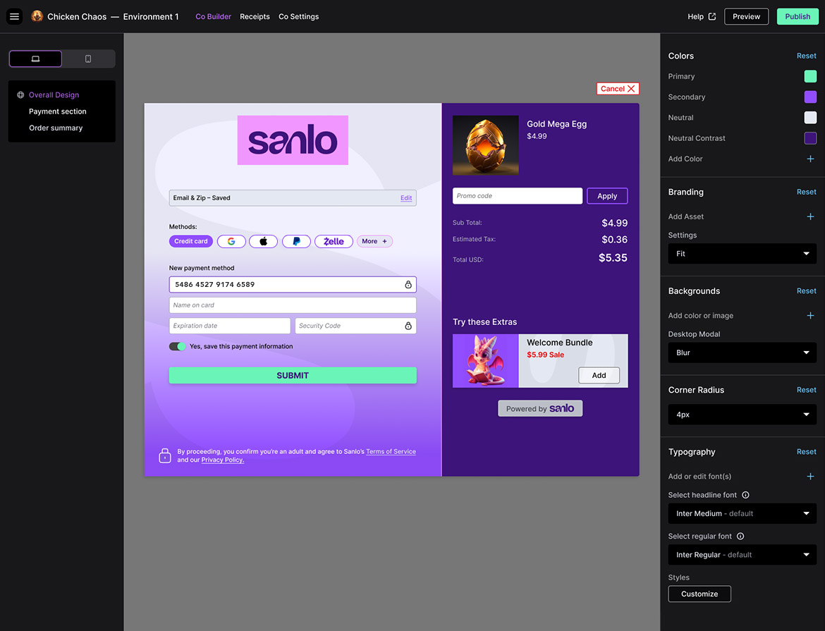
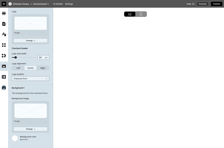
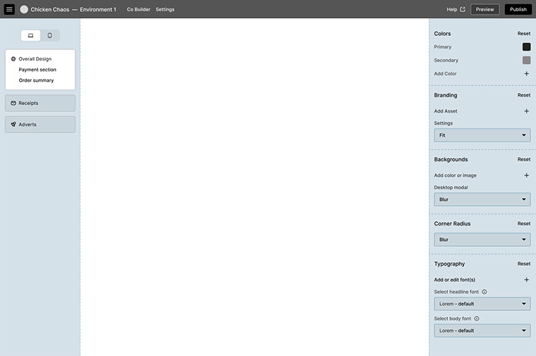
Build the Checkout Builder as a Standalone Product
Research was unambiguous: studios wanted a dedicated checkout and receipt builder. It was the top-ranked missing feature, and its absence was the most concrete reason Sanlo lost evaluations to competitors. I treated the checkout builder as a zero-to-one product within the redesign.
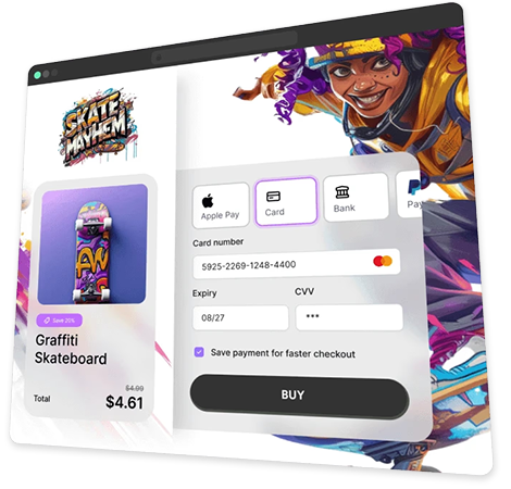
I ran two rounds of concept testing to determine the builder's layout. An icon-only left-panel design created too much cognitive load and required further design investment; a dual-panel approach, left panel controlling the tools in the right viewport, proved clearer and faster to execute. A centered canvas was the strong user preference. From there, I designed and tested the consumer-facing checkout experience, finding that grouping payment methods and introducing a separate first-time customer flow produced the most intuitive flow.
Icon-only left-panel design
Dual panel design
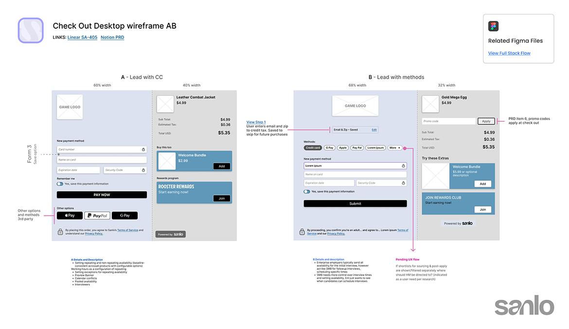
Consumer-facing checkout wireframes
Address Usability Debt Directly
Color Adjustments
Hey there, this is the default text for a new paragraph. Feel free to edit this paragraph by clicking on the yellow edit icon. After you are done just click on the yellow checkmark button on the top right. Have Fun!
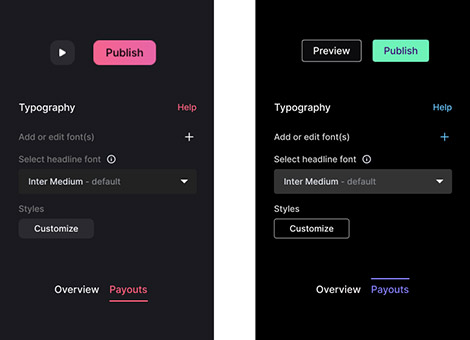
The established visual design had accessibility issues, with low contrast and used the same soft red for primary buttons, delete actions, and active states. I documented the issues, made the business case for remediation, and drove color system updates that created clear visual distinction between action types.
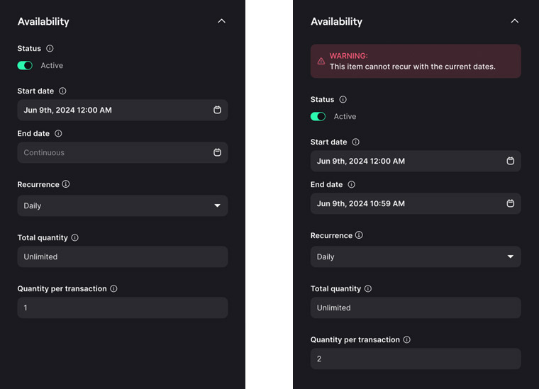
Breaking recurrence
A logic conflict between date settings could silently prevent items from appearing in the store. I designed a temporary UX solution that made the constraint legible to users and prevented silent failures, buying time until a full engineering resolution was resourced.
Prioritize Features Based on Research, Not Instinct
Fourteen studios ranked their most desired features via survey. I used that data, alongside card sorting sessions and competitive analysis, to sequence the work: item management improvements and custom font controls were high-desire, lower-engineering-lift additions that could move in parallel with the bigger architectural and product work.
Every prioritization decision was made with a clear-eyed view of engineering capacity. Speed mattered. A lean process with targeted concept testing rather than exhaustive research cycles.
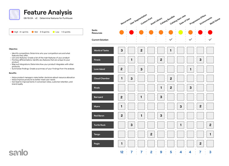
Competitive analysis


Results & Impact
The redesigned platform, architecture, new standalone products, and a corrected visual foundation resulted in a 25% increase in revenue following the work. Reflecting both improved conversion within the platform and the ability to win new enterprise customers, the previous version couldn't.
25%
Increase in
revenue
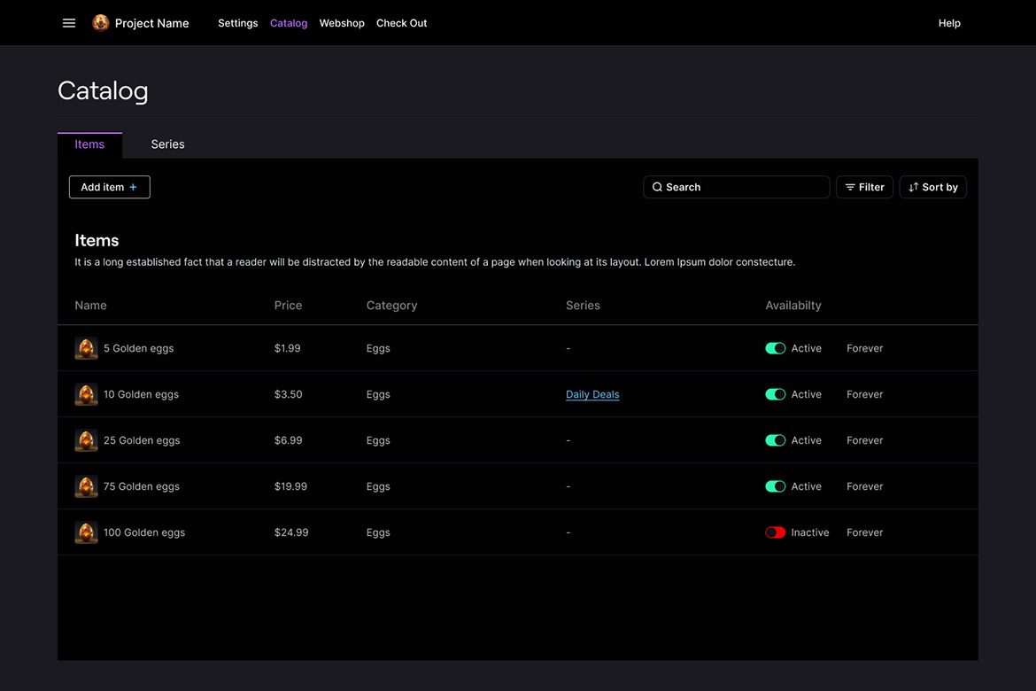
Redesigned Catalog with new Series tab

Front end check-out proof of concept
Universal module component
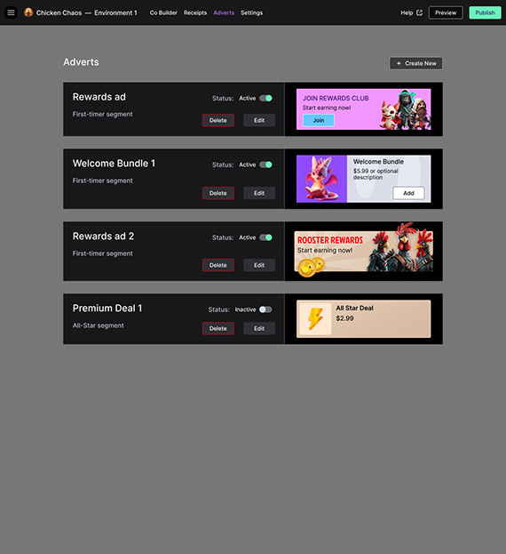
Adverts builder concept
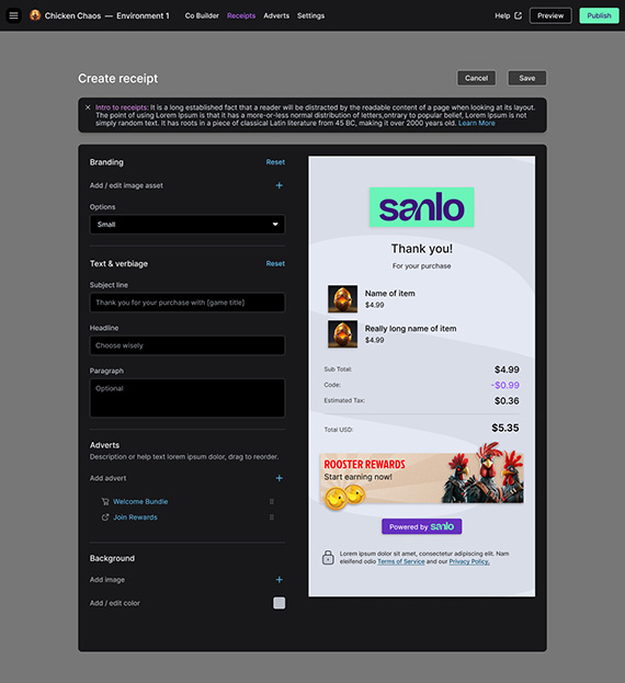
Receipt Builder
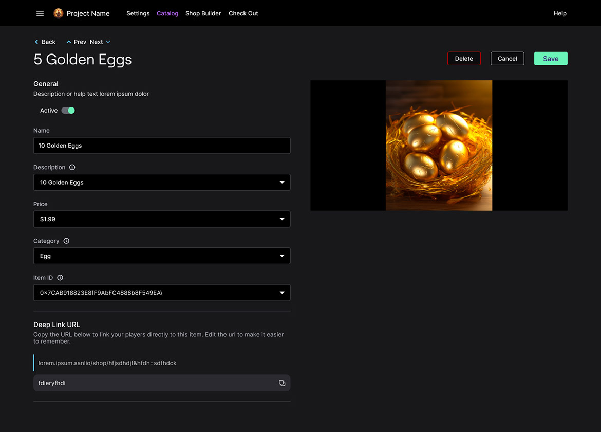
Catalog item view
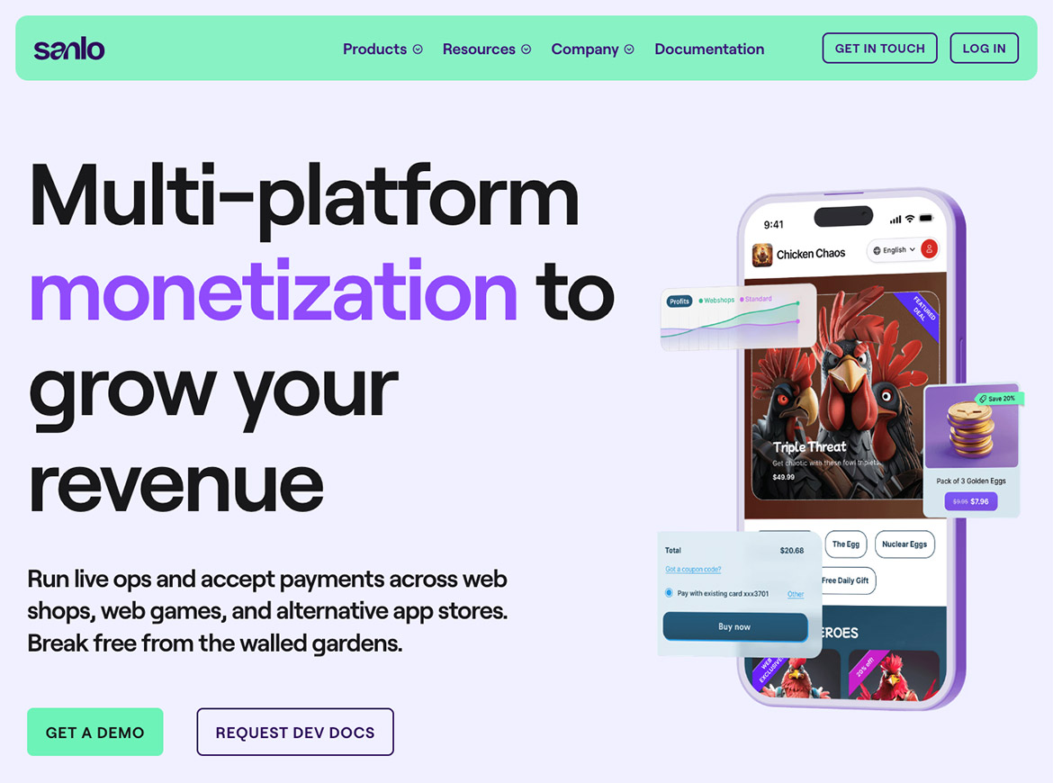
Marketing website brand update